Warning: package 'gtExtras' was built under R version 4.4.3
About the dataset
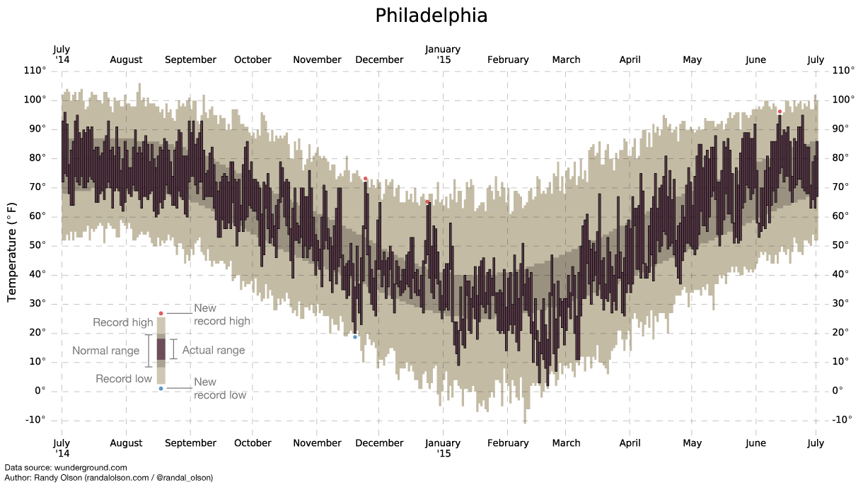
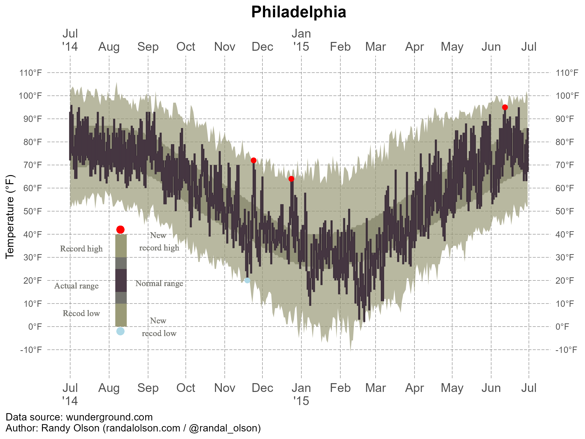
In this exercise, I use US Weather History Dataset which contains weather summary of several cities. In this exercise, I only use Philadelphia as example, because the chart are same across the cities. I got the dataset and chart from fivethirtyeight. Link: https://fivethirtyeight.com/features/what-12-months-of-record-setting-temperatures-looks-like-across-the-u-s/
#| label: fig-temperature#| fig-cap: "Temperature Record in Philadelphia."#| echo: FALSEknitr::include_graphics(here("presentation-exercise","results","figures","phila-ori.png"))
Read the dataset
# Load the datasetdata_loc <-here("presentation-exercise", "data", "KPHL.csv") data <-read_csv(data_loc)
Rows: 365 Columns: 13
── Column specification ────────────────────────────────────────────────────────
Delimiter: ","
chr  (1): date
dbl (12): actual_mean_temp, actual_min_temp, actual_max_temp, average_min_te...

ℹ Use `spec()` to retrieve the full column specification for this data.
ℹ Specify the column types or set `show_col_types = FALSE` to quiet this message.
data$date <-as.Date(data$date, format="%Y-%m-%d") # convert variable into date format head(data)
      date            actual_mean_temp actual_min_temp actual_max_temp
 Min.   :2014-07-01   Min.   :10.00    Min.   : 2.00   Min.   :17.00
 1st Qu.:2014-09-30   1st Qu.:39.00    1st Qu.:33.00   1st Qu.:46.00
 Median :2014-12-30   Median :59.00    Median :50.00   Median :69.00
 Mean   :2014-12-30   Mean   :55.88    Mean   :47.27   Mean   :63.98
 3rd Qu.:2015-03-31   3rd Qu.:73.00    3rd Qu.:64.00   3rd Qu.:82.00
 Max.   :2015-06-30   Max.   :86.00    Max.   :77.00   Max.   :96.00
 average_min_temp average_max_temp record_min_temp  record_max_temp
 Min.   :25.00    Min.   :40.00    Min.   :-11.00   Min.   : 61.00
 1st Qu.:32.00    1st Qu.:49.00    1st Qu.:  9.00   1st Qu.: 73.00
 Median :46.00    Median :66.00    Median : 29.00   Median : 88.00
 Mean   :47.22    Mean   :64.72    Mean   : 28.03   Mean   : 84.99
 3rd Qu.:63.00    3rd Qu.:81.00    3rd Qu.: 46.00   3rd Qu.: 97.00
 Max.   :70.00    Max.   :87.00    Max.   : 59.00   Max.   :106.00
 record_min_temp_year record_max_temp_year actual_precipitation
 Min.   :1872         Min.   :1874         Min.   :0.0000
 1st Qu.:1930         1st Qu.:1931         1st Qu.:0.0000
 Median :1960         Median :1957         Median :0.0000
 Mean   :1947         Mean   :1958         Mean   :0.1245
 3rd Qu.:1969         3rd Qu.:1990         3rd Qu.:0.0500
 Max.   :2014         Max.   :2014         Max.   :2.0100
 average_precipitation record_precipitation
 Min.   :0.0800        Min.   :0.850
 1st Qu.:0.1000        1st Qu.:1.550
 Median :0.1100        Median :1.880
 Mean   :0.1138        Mean   :2.135
 3rd Qu.:0.1200        3rd Qu.:2.490
 Max.   :0.1500        Max.   :8.020
Prompt to AI
Me: Hi Good morning, thanks for being my best friend for coding activities.
ChatGPT: Of course, I will be always be your friend, what can I help you?
Me: Today, I want to regenerate a chart. Here I provide the picture of the chart, the original link of the chart, and the dataset. Please generate the code to create the exact same chart, including the color, display, and also legend. Please look at the chart very details to be able to create the same chart. Please generate the code in R.
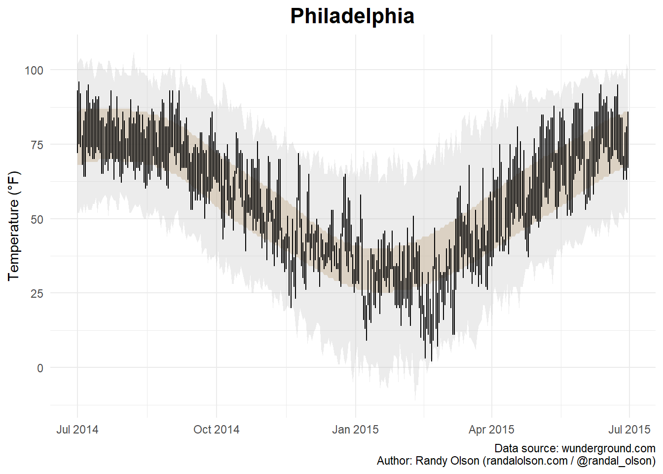
# Create the plotplot_1 <-ggplot(data, aes(x = date)) +# Shaded area for normal rangegeom_ribbon(aes(ymin = average_min_temp, ymax = average_max_temp), fill ="tan", alpha =0.5) +# Shaded area for record rangegeom_ribbon(aes(ymin = record_min_temp, ymax = record_max_temp), fill ="grey", alpha =0.3) +# Lines for actual min and max tempsgeom_linerange(aes(ymin = actual_min_temp, ymax = actual_max_temp), color ="black") +# Points for new record highs and lowsgeom_point(data =filter(data, actual_max_temp > record_max_temp), aes(y = actual_max_temp), color ="red", size =2) +geom_point(data =filter(data, actual_min_temp < record_min_temp), aes(y = actual_min_temp), color ="blue", size =2) +# Labels and themeslabs(title ="Philadelphia",x =NULL,y ="Temperature (°F)",caption ="Data source: wunderground.com\nAuthor: Randy Olson (randalolson.com / @randal_olson)") +theme_minimal() +theme(plot.title =element_text(hjust =0.5, size =16, face ="bold"))plot(plot_1)
Me: Hi, thank you for generating the code. However, there are some detail different with the original chart.
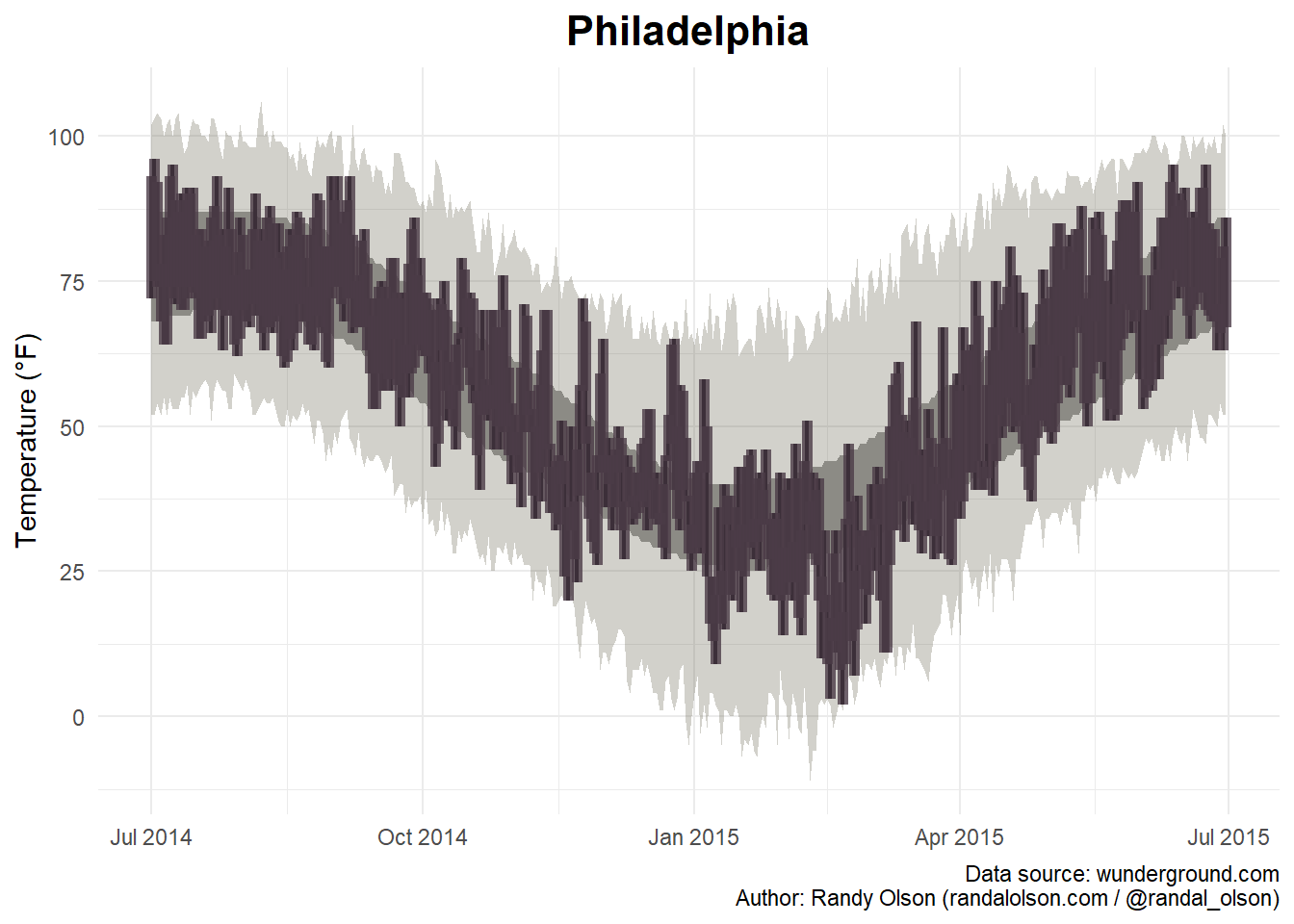
Here, I modify by myself with some help from ChatGPT. In this step, I try to adjust the line. I see from the original chart, it is look more bar than line.
# Create the plotplot_2 <-ggplot(data, aes(x = date)) +# Shaded area for normal rangegeom_ribbon(aes(ymin = average_min_temp, ymax = average_max_temp), fill ="#9B9B9B", alpha =1) +# Shaded area for record rangegeom_ribbon(aes(ymin = record_min_temp, ymax = record_max_temp), fill ="#696651", alpha =0.3) +geom_linerange(aes(ymin = actual_min_temp, ymax = actual_max_temp), color ="black", size =0.8) +geom_linerange(aes(ymin = actual_min_temp, ymax = actual_max_temp), color ="#4B3B47", size =2, alpha =0.8)+geom_point(data =filter(data, actual_max_temp > record_max_temp), aes(y = actual_max_temp), color ="red", size =10) +geom_point(data =filter(data, actual_min_temp < record_min_temp), aes(y = actual_min_temp), color ="blue", size =2) +# Labels and themeslabs(title ="Philadelphia",x =NULL,y ="Temperature (°F)",caption ="Data source: wunderground.com\nAuthor: Randy Olson (randalolson.com / @randal_olson)") +theme_minimal() +theme(plot.title =element_text(hjust =0.5, size =16, face ="bold"))
Warning: Using `size` aesthetic for lines was deprecated in ggplot2 3.4.0.
ℹ Please use `linewidth` instead.
plot(plot_2)
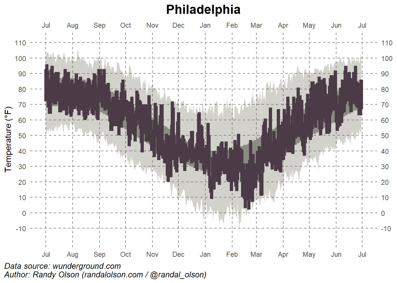
This is the step where I change many things, including, put the date (months) in both sides (top and bottom, and put ’14 below Jul, and ’15 below Jan), I also put the temperature both side. In the previous chart, the grip also did not show every month. Therefore, I adjust the grip into each month and the temperature for every 10 Fahrenheit degree. I adjust the position of the caption (source and author).
plot_3 <-ggplot(data, aes(x = date)) +# Shaded area for normal rangegeom_ribbon(aes(ymin = average_min_temp, ymax = average_max_temp), fill ="#9B9B9B", alpha =1) +# Shaded area for record rangegeom_ribbon(aes(ymin = record_min_temp, ymax = record_max_temp), fill ="#696651", alpha =0.3) +# Temperature rangesgeom_linerange(aes(ymin = actual_min_temp, ymax = actual_max_temp), color ="black", linewidth =0.8) +geom_linerange(aes(ymin = actual_min_temp, ymax = actual_max_temp), color ="#4B3B47", linewidth =2, linetype =1) +# Record-breaking temperatures (Fixed)geom_point(data = data %>%filter(!is.na(actual_max_temp), actual_max_temp > record_max_temp),aes(x = date, y = actual_max_temp), color ="red", size =3) +geom_point(data = data %>%filter(!is.na(actual_min_temp), actual_min_temp < record_min_temp),aes(x = date, y = actual_min_temp), color ="blue", size =3) +# Labels and themeslabs(title ="Philadelphia",x =NULL,y ="Temperature (°F)",caption ="Data source: wunderground.com\nAuthor: Randy Olson (randalolson.com / @randal_olson)") +# Custom themetheme_minimal() +theme(plot.title =element_text(hjust =0.5, size =16, face ="bold"),panel.background =element_rect(fill ="white", color =NA),panel.grid.major =element_line(color ="grey50", linetype ="dashed"), # Remove empty linetype valuepanel.grid.minor =element_blank(),# Align caption to the leftplot.caption.position ="plot",plot.caption =element_text(hjust =0, face ="italic", size =10) ) +# Define x-axis (date) for both top and bottomscale_x_date(date_breaks ="1 month", date_labels ="%b",sec.axis =dup_axis(name =NULL)) +# Duplicate axis at top# Define y-axis (temperature) for both left and rightscale_y_continuous(breaks =seq(-10, 110, 10),sec.axis =dup_axis(name =NULL),limits =c(min(data$record_min_temp) -5, max(data$record_max_temp) +5)) # Ensure all values fit# Plot the chartplot(plot_3)
The chart looks much better. However, the new record for high and low temperature did not show up in the chart. Therefore, I try to create a new set then insert it into the chart.
# Identify new record highs and lowsweather_data_subset <- datanew_max_records <- weather_data_subset %>%filter(record_max_temp <= actual_max_temp)new_min_records <- weather_data_subset %>%filter(record_min_temp >= actual_min_temp)# Insert the new record into the plot plot1 <-ggplot(weather_data_subset, aes(x = date)) +# Shaded area for normal rangegeom_ribbon(aes(ymin = average_min_temp, ymax = average_max_temp), fill ="#73736D", alpha =0.9) +# Shaded area for record rangegeom_ribbon(aes(ymin = record_min_temp, ymax = record_max_temp), fill ="#9a9a77", alpha =0.7) +# Temperature rangesgeom_linerange(aes(ymin = actual_min_temp, ymax = actual_max_temp), color ="black", linewidth =0.8) +geom_linerange(aes(ymin = actual_min_temp, ymax = actual_max_temp), color ="#4B3B47", linewidth =1, alpha =0.8) +# Record-breaking temperaturesgeom_point(data = new_max_records, aes(x = date, y = actual_max_temp), color ="red", size =2) +geom_point(data = new_min_records, aes(x = date, y = actual_min_temp), color ="lightblue", size =2) +# create the legend geom_rect(aes(xmin =as.Date("2014-08-10") -4, xmax =as.Date("2014-08-11") +4, ymin =0, ymax =40), fill ="#9a9a77", alpha =0.7) +# First bargeom_rect(aes(xmin =as.Date("2014-08-10") -4, xmax =as.Date("2014-08-11") +4, ymin =10, ymax =30), fill ="#73736D", alpha =0.9) +# Second bargeom_rect(aes(xmin =as.Date("2014-08-10") -4, xmax =as.Date("2014-08-11") +4, ymin =15, ymax =25), fill ="#4B3B47", alpha =0.8) +# Third bar## Add two points inside the horizontal bargeom_point(aes(x =as.Date("2014-08-10"), y =42), color ="red", size =3) +# Point 1geom_point(aes(x =as.Date("2014-08-10"), y =-2), color ="lightblue", size =3) +# Point 2geom_text(aes(x =as.Date("2014-09-10"), y =25, label ="New \nrecord high"), family="Serif", color ="#73736D", vjust =-1, size =3) +# adding text geom_text(aes(x =as.Date("2014-09-10"), y =-12, label ="New \nrecod low"), family ="Serif",color ="#73736D", vjust =-1, size =3) +# Adding text geom_text(aes(x =as.Date("2014-07-10"), y =30, label ="Record high"), family ="Serif", color ="#73736D", vjust =-1, size =3) +# adding text geom_text(aes(x =as.Date("2014-07-10"), y =2, label ="Recod low"), family ="Serif", color ="#73736D", vjust =-1, size =3) +# Adding text geom_text(aes(x =as.Date("2014-09-10"), y =15, label ="Normal range"), family ="Serif", color ="#73736D", vjust =-1, size =3) +# adding text geom_text(aes(x =as.Date("2014-07-06"), y =14, label ="Actual range"), family ="Serif",color ="#73736D", vjust =-1, size =3) +# Adding text # Labels and themeslabs(title ="Philadelphia",x =NULL,y ="Temperature (°F)",caption ="Data source: wunderground.com\nAuthor: Randy Olson (randalolson.com / @randal_olson)") +# Custom themetheme_minimal() +theme(plot.title =element_text(hjust =0.5, size =16, face ="bold"),panel.background =element_rect(fill ="white", color =NA),panel.grid.major =element_line(color ="grey50", linetype ="longdash", linewidth=0.2),panel.grid.minor =element_blank(),plot.caption.position ="plot",plot.caption =element_text(hjust =0, size =10),axis.text.x =element_text(size =12) # Ensure x-axis labels are readable ) +# Custom x-axis labelsscale_x_date(breaks =seq(as.Date("2014-07-01"), as.Date("2015-07-01"), by ="1 month"),labels =c("Jul\n'14", "Aug", "Sep", "Oct", "Nov", "Dec", "Jan\n'15", "Feb", "Mar", "Apr", "May", "Jun", "Jul"), # Jul\'14 is to place '14 under Jul, and the same for jan 15sec.axis =dup_axis(name =NULL) ) +# Define y-axis (temperature)scale_y_continuous(breaks =seq(-10, 110, 10),sec.axis =dup_axis(name =NULL),limits =c(min(weather_data_subset$record_min_temp) -5, max(weather_data_subset$record_max_temp) +5),labels =function(x) paste0(x, "°F")) # Add degree symbol to y-axis labels# save the chartchart_location <-here( "presentation-exercise","results", "figures", "philadelphia.png") # to set up location for the pictures created ggsave(filename = chart_location, plot=plot1, width =8, height =6, units ="in", dpi =300) # save the pictures created
Warning in geom_point(aes(x = as.Date("2014-08-10"), y = 42), color = "red", : All aesthetics have length 1, but the data has 365 rows.
ℹ Please consider using `annotate()` or provide this layer with data containing
  a single row.
Warning in geom_point(aes(x = as.Date("2014-08-10"), y = -2), color = "lightblue", : All aesthetics have length 1, but the data has 365 rows.
ℹ Please consider using `annotate()` or provide this layer with data containing
  a single row.
Warning in geom_text(aes(x = as.Date("2014-09-10"), y = 25, label = "New \nrecord high"), : All aesthetics have length 1, but the data has 365 rows.
ℹ Please consider using `annotate()` or provide this layer with data containing
  a single row.
Warning in geom_text(aes(x = as.Date("2014-09-10"), y = -12, label = "New \nrecod low"), : All aesthetics have length 1, but the data has 365 rows.
ℹ Please consider using `annotate()` or provide this layer with data containing
  a single row.
Warning in geom_text(aes(x = as.Date("2014-07-10"), y = 30, label = "Record high"), : All aesthetics have length 1, but the data has 365 rows.
ℹ Please consider using `annotate()` or provide this layer with data containing
  a single row.
Warning in geom_text(aes(x = as.Date("2014-07-10"), y = 2, label = "Recod low"), : All aesthetics have length 1, but the data has 365 rows.
ℹ Please consider using `annotate()` or provide this layer with data containing
  a single row.
Warning in geom_text(aes(x = as.Date("2014-09-10"), y = 15, label = "Normal range"), : All aesthetics have length 1, but the data has 365 rows.
ℹ Please consider using `annotate()` or provide this layer with data containing
  a single row.
Warning in geom_text(aes(x = as.Date("2014-07-06"), y = 14, label = "Actual range"), : All aesthetics have length 1, but the data has 365 rows.
ℹ Please consider using `annotate()` or provide this layer with data containing
  a single row.
The most challenging part in this chart is the legend. I spent hours to work on it. Finally I made it, but not exactly same.
Figure 1: Temperature Record in Philadelphia (imitation)
Part 2: Creating a table
I create a table containing weather summary of Philadelphia in each season. To create this table, I got help from ChatGPT, I added multiple prompt step by step. I went through multiple steps.
Before asking AI to generate the code to create a table, I create subsets for each seasons.
#extract dataweather_data <- data# Extract month for filteringweather_data$Month <-format(data$date, "%m")# Create subsetssummer <-filter(weather_data, Month %in%c("06", "07", "08")) # June - Augustfall <-filter(weather_data, Month %in%c("09", "10", "11")) # September - Novemberwinter <-filter(weather_data, Month %in%c("12", "01", "02")) # December - Februaryspring <-filter(weather_data, Month %in%c("03", "04", "05")) # March - Maysummary(summer)
      date            actual_mean_temp actual_min_temp actual_max_temp
 Min.   :2014-07-01   Min.   :56.00    Min.   :53.00   Min.   :58.00
 1st Qu.:2014-07-23   1st Qu.:73.00    1st Qu.:64.00   1st Qu.:81.00
 Median :2014-08-15   Median :76.00    Median :68.00   Median :84.50
 Mean   :2014-11-12   Mean   :76.14    Mean   :67.30   Mean   :84.35
 3rd Qu.:2015-06-07   3rd Qu.:80.00    3rd Qu.:70.25   3rd Qu.:89.00
 Max.   :2015-06-30   Max.   :86.00    Max.   :77.00   Max.   :96.00
 average_min_temp average_max_temp record_min_temp record_max_temp
 Min.   :59.00    Min.   :79.00    Min.   :44.00   Min.   : 93.00
 1st Qu.:66.00    1st Qu.:84.00    1st Qu.:48.75   1st Qu.: 98.00
 Median :68.00    Median :86.00    Median :52.00   Median : 99.00
 Mean   :67.09    Mean   :85.04    Mean   :51.68   Mean   : 99.16
 3rd Qu.:69.00    3rd Qu.:87.00    3rd Qu.:55.00   3rd Qu.:100.25
 Max.   :70.00    Max.   :87.00    Max.   :59.00   Max.   :106.00
 record_min_temp_year record_max_temp_year actual_precipitation
 Min.   :1884         Min.   :1888         Min.   :0.0000
 1st Qu.:1952         1st Qu.:1930         1st Qu.:0.0000
 Median :1963         Median :1957         Median :0.0000
 Mean   :1960         Mean   :1961         Mean   :0.1818
 3rd Qu.:1972         3rd Qu.:1994         3rd Qu.:0.1950
 Max.   :1999         Max.   :2012         Max.   :1.9600
 average_precipitation record_precipitation    Month
 Min.   :0.0900        Min.   :1.040        Length:92
 1st Qu.:0.1100        1st Qu.:1.958        Class :character
 Median :0.1200        Median :2.440        Mode  :character
 Mean   :0.1226        Mean   :2.689
 3rd Qu.:0.1400        3rd Qu.:3.050
 Max.   :0.1500        Max.   :8.020
summary(fall)
      date            actual_mean_temp actual_min_temp actual_max_temp
 Min.   :2014-09-01   Min.   :28.00    Min.   :20.00   Min.   :36.00
 1st Qu.:2014-09-23   1st Qu.:50.50    1st Qu.:42.00   1st Qu.:57.00
 Median :2014-10-16   Median :61.00    Median :52.00   Median :70.00
 Mean   :2014-10-16   Mean   :58.79    Mean   :50.54   Mean   :66.55
 3rd Qu.:2014-11-07   3rd Qu.:67.00    3rd Qu.:59.00   3rd Qu.:75.00
 Max.   :2014-11-30   Max.   :84.00    Max.   :74.00   Max.   :93.00
 average_min_temp average_max_temp record_min_temp record_max_temp
 Min.   :35.00    Min.   :50.00    Min.   : 8.00   Min.   : 70.00
 1st Qu.:41.50    1st Qu.:59.00    1st Qu.:25.00   1st Qu.: 78.00
 Median :48.00    Median :67.00    Median :31.00   Median : 87.00
 Mean   :49.34    Mean   :66.95    Mean   :31.53   Mean   : 85.23
 3rd Qu.:57.50    3rd Qu.:75.00    3rd Qu.:39.00   3rd Qu.: 92.00
 Max.   :65.00    Max.   :83.00    Max.   :53.00   Max.   :102.00
 record_min_temp_year record_max_temp_year actual_precipitation
 Min.   :1875         Min.   :1879         Min.   :0.0000
 1st Qu.:1944         1st Qu.:1927         1st Qu.:0.0000
 Median :1961         Median :1949         Median :0.0000
 Mean   :1954         Mean   :1949         Mean   :0.0911
 3rd Qu.:1969         3rd Qu.:1975         3rd Qu.:0.0100
 Max.   :2013         Max.   :2014         Max.   :1.0500
 average_precipitation record_precipitation    Month
 Min.   :0.0800        Min.   :0.900        Length:91
 1st Qu.:0.1000        1st Qu.:1.600        Class :character
 Median :0.1100        Median :1.950        Mode  :character
 Mean   :0.1093        Mean   :2.276
 3rd Qu.:0.1200        3rd Qu.:2.725
 Max.   :0.1400        Max.   :6.630
summary(winter)
      date            actual_mean_temp actual_min_temp actual_max_temp
 Min.   :2014-12-01   Min.   :10.00    Min.   : 2.00   Min.   :17.00
 1st Qu.:2014-12-23   1st Qu.:27.25    1st Qu.:20.00   1st Qu.:34.00
 Median :2015-01-14   Median :34.00    Median :27.00   Median :41.00
 Mean   :2015-01-14   Mean   :33.06    Mean   :25.74   Mean   :39.87
 3rd Qu.:2015-02-05   3rd Qu.:39.75    3rd Qu.:33.00   3rd Qu.:45.75
 Max.   :2015-02-28   Max.   :56.00    Max.   :47.00   Max.   :65.00
 average_min_temp average_max_temp record_min_temp   record_max_temp
 Min.   :25.00    Min.   :40.00    Min.   :-11.000   Min.   :61.00
 1st Qu.:26.00    1st Qu.:41.00    1st Qu.:  0.000   1st Qu.:65.00
 Median :27.00    Median :42.00    Median :  3.000   Median :68.00
 Mean   :27.84    Mean   :42.94    Mean   :  2.778   Mean   :68.03
 3rd Qu.:29.00    3rd Qu.:45.00    3rd Qu.:  6.750   3rd Qu.:70.00
 Max.   :34.00    Max.   :50.00    Max.   : 15.000   Max.   :79.00
 record_min_temp_year record_max_temp_year actual_precipitation
 Min.   :1875         Min.   :1874         Min.   :0.0000
 1st Qu.:1897         1st Qu.:1941         1st Qu.:0.0000
 Median :1942         Median :1968         Median :0.0000
 Mean   :1937         Mean   :1963         Mean   :0.1128
 3rd Qu.:1977         3rd Qu.:1996         3rd Qu.:0.0475
 Max.   :2014         Max.   :2013         Max.   :1.8400
 average_precipitation record_precipitation    Month
 Min.   :0.0900        Min.   :0.900        Length:90
 1st Qu.:0.0900        1st Qu.:1.343        Class :character
 Median :0.1000        Median :1.585        Mode  :character
 Mean   :0.1027        Mean   :1.687
 3rd Qu.:0.1100        3rd Qu.:1.847
 Max.   :0.1300        Max.   :3.860
summary(spring)
      date            actual_mean_temp actual_min_temp actual_max_temp
 Min.   :2015-03-01   Min.   :19.00    Min.   :11.00   Min.   :26.00
 1st Qu.:2015-03-23   1st Qu.:44.00    1st Qu.:34.00   1st Qu.:51.75
 Median :2015-04-15   Median :56.00    Median :46.00   Median :66.50
 Mean   :2015-04-15   Mean   :55.09    Mean   :45.04   Mean   :64.67
 3rd Qu.:2015-05-08   3rd Qu.:65.50    3rd Qu.:54.00   3rd Qu.:77.00
 Max.   :2015-05-31   Max.   :81.00    Max.   :71.00   Max.   :92.00
 average_min_temp average_max_temp record_min_temp record_max_temp
 Min.   :30.00    Min.   :48.00    Min.   : 5.00   Min.   :71.00
 1st Qu.:36.75    1st Qu.:55.75    1st Qu.:14.00   1st Qu.:82.00
 Median :44.00    Median :64.00    Median :27.00   Median :90.00
 Mean   :44.22    Mean   :63.51    Mean   :25.62   Mean   :87.16
 3rd Qu.:51.25    3rd Qu.:71.25    3rd Qu.:35.25   3rd Qu.:92.25
 Max.   :59.00    Max.   :78.00    Max.   :43.00   Max.   :97.00
 record_min_temp_year record_max_temp_year actual_precipitation
 Min.   :1872         Min.   :1880         Min.   :0.0000
 1st Qu.:1894         1st Qu.:1936         1st Qu.:0.0000
 Median :1956         Median :1962         Median :0.0000
 Mean   :1938         Mean   :1958         Mean   :0.1118
 3rd Qu.:1966         3rd Qu.:1990         3rd Qu.:0.0300
 Max.   :2002         Max.   :2013         Max.   :2.0100
 average_precipitation record_precipitation    Month
 Min.   :0.1000        Min.   :0.850        Length:92
 1st Qu.:0.1100        1st Qu.:1.478        Class :character
 Median :0.1200        Median :1.765        Mode  :character
 Mean   :0.1202        Mean   :1.882
 3rd Qu.:0.1300        3rd Qu.:2.192
 Max.   :0.1400        Max.   :4.420
In this step, I used ChatGPT to create table. Here is the prompt that I used:
Now I have 4 subsets: summer, fall,, winter, and spring. Those subsets have actual_mean_temp, average_min_temp, average_max_temp, average_precipitation. I want to create a beautiful and easy read table. Please give me idea and step by step, including code.
The first table generated did not look good. Therefore, I add more prompt in each feature that I want. For example, I want to add icons representing the season, I want to arrange indicators in the column, and seasons as rows. I actually added more prompt.
# Summarize the data for each seasonsummary_table <-bind_rows( summer %>%summarise(Season ="Summer", `Avg Min Temp (°F)`=mean(average_min_temp, na.rm =TRUE),`Avg Mean Temp (°F)`=mean(actual_mean_temp, na.rm =TRUE),`Avg Max Temp (°F)`=mean(average_max_temp, na.rm =TRUE),`Avg Precipitation (inches)`=mean(average_precipitation, na.rm =TRUE)), fall %>%summarise(Season ="Fall", `Avg Min Temp (°F)`=mean(average_min_temp, na.rm =TRUE),`Avg Mean Temp (°F)`=mean(actual_mean_temp, na.rm =TRUE),`Avg Max Temp (°F)`=mean(average_max_temp, na.rm =TRUE),`Avg Precipitation (inches)`=mean(average_precipitation, na.rm =TRUE)), winter %>%summarise(Season ="Winter", `Avg Min Temp (°F)`=mean(average_min_temp, na.rm =TRUE),`Avg Mean Temp (°F)`=mean(actual_mean_temp, na.rm =TRUE),`Avg Max Temp (°F)`=mean(average_max_temp, na.rm =TRUE),`Avg Precipitation (inches)`=mean(average_precipitation, na.rm =TRUE)), spring %>%summarise(Season ="Spring", `Avg Min Temp (°F)`=mean(average_min_temp, na.rm =TRUE),`Avg Mean Temp (°F)`=mean(actual_mean_temp, na.rm =TRUE),`Avg Max Temp (°F)`=mean(average_max_temp, na.rm =TRUE),`Avg Precipitation (inches)`=mean(average_precipitation, na.rm =TRUE)))
# Add seasonal icons in a separate columnsummary_table <- summary_table %>%mutate(``=c("☀️", "🍂", "❄️", "🌸")) # Adding icons for Summer, Fall, Winter, Spring# Create a styled gt tablestyled_table <- summary_table %>%gt() %>%tab_header(title =md("**Philadelphia Seasonal Weather Summary**"),subtitle =md("*Weather data from July 2014 - June 2015*") ) %>%tab_spanner(label ="Temperature (°F)", columns =c(`Avg Min Temp (°F)`, `Avg Mean Temp (°F)`, `Avg Max Temp (°F)`)) %>%tab_spanner(label ="Precipitation", columns =`Avg Precipitation (inches)`) %>%fmt_number(columns =where(is.numeric),decimals =1 ) %>%cols_move_to_start(columns ="Season") %>%cols_move(columns =" ", after ="Season") %>%# Moves icon column after seasoncols_align(align ="left",columns ="Season"# Keep Season column left-aligned ) %>%cols_align(align ="center",columns =c(``, `Avg Min Temp (°F)`, `Avg Mean Temp (°F)`, `Avg Max Temp (°F)`, `Avg Precipitation (inches)`) # Center all other columns ) %>%tab_source_note(md("**Source:** https://www.wunderground.com/, July 2014 - June 2015.")) %>%tab_footnote(footnote ="Precipitation measured in inches", locations =cells_column_labels(columns =`Avg Precipitation (inches)`))%>%data_color(columns =c(`Avg Min Temp (°F)`, `Avg Max Temp (°F)`),colors = scales::col_numeric(palette =c("blue", "white", "red"),domain =range(summary_table$`Avg Min Temp (°F)`, summary_table$`Avg Max Temp (°F)`) ) )
Warning: Since gt v0.9.0, the `colors` argument has been deprecated.
• Please use the `fn` argument instead.
This warning is displayed once every 8 hours.
table_file1 =here("presentation-exercise","results", "tables", "weather.rds")saveRDS(styled_table, file = table_file1)# Print the tablestyled_table