Placeholder file for the future R coding exercise.
Install all packages needed
Install and library all packages needed in this section.
install.packages("dslabs") #if we have not install this packages, we need to indtall it. This packege is for the data set
The following package(s) will be installed:
- dslabs [0.8.0]
These packages will be installed into "C:/Users/mn27712/MADA_NEW/muhammadnasir-mada2025-portofolio/renv/library/windows/R-4.4/x86_64-w64-mingw32".

# Installing packages --------------------------------------------------------
- Installing dslabs ...                         OK [linked from cache]
Successfully installed 1 package in 24 milliseconds.
install.packages("tidyverse")
The following package(s) will be installed:
- tidyverse [2.0.0]
These packages will be installed into "C:/Users/mn27712/MADA_NEW/muhammadnasir-mada2025-portofolio/renv/library/windows/R-4.4/x86_64-w64-mingw32".

# Installing packages --------------------------------------------------------
- Installing tidyverse ...                      OK [linked from cache]
Successfully installed 1 package in 12 milliseconds.
library(tidyverse)
Warning: package 'tibble' was built under R version 4.4.3
Warning: package 'tidyr' was built under R version 4.4.3
Warning: package 'readr' was built under R version 4.4.3
Warning: package 'purrr' was built under R version 4.4.3
Warning: package 'dplyr' was built under R version 4.4.3
Warning: package 'forcats' was built under R version 4.4.3
── Attaching core tidyverse packages ──────────────────────── tidyverse 2.0.0 ──
✔ dplyr     1.1.4     ✔ readr     2.1.5
✔ forcats   1.0.0     ✔ stringr   1.5.1
✔ ggplot2   3.5.2     ✔ tibble    3.2.1
✔ lubridate 1.9.4     ✔ tidyr     1.3.1
✔ purrr     1.0.4
── Conflicts ────────────────────────────────────────── tidyverse_conflicts() ──
✖ dplyr::filter() masks stats::filter()
✖ dplyr::lag()    masks stats::lag()
ℹ Use the conflicted package (<http://conflicted.r-lib.org/>) to force all conflicts to become errors
install.packages("ggplot2")
The following package(s) will be installed:
- ggplot2 [3.5.2]
These packages will be installed into "C:/Users/mn27712/MADA_NEW/muhammadnasir-mada2025-portofolio/renv/library/windows/R-4.4/x86_64-w64-mingw32".

# Installing packages --------------------------------------------------------
- Installing ggplot2 ...                        OK [linked from cache]
Successfully installed 1 package in 12 milliseconds.
library(ggplot2)library(here)
here() starts at C:/Users/mn27712/MADA_NEW/muhammadnasir-mada2025-portofolio
install.packages("patchwork") # This package is to redefine "/" operator for plot arrangement
The following package(s) will be installed:
- patchwork [1.3.0]
These packages will be installed into "C:/Users/mn27712/MADA_NEW/muhammadnasir-mada2025-portofolio/renv/library/windows/R-4.4/x86_64-w64-mingw32".

# Installing packages --------------------------------------------------------
- Installing patchwork ...                      OK [linked from cache]
Successfully installed 1 package in 13 milliseconds.
library(patchwork)
Warning: package 'patchwork' was built under R version 4.4.3
Loading Dataset
In this projec, we use data from dslabs.
library(dslabs)
Warning: package 'dslabs' was built under R version 4.4.3
help("gapminder") # this is to look at the description about the data
starting httpd help server ... done
let’s look at the overview of the data structure
str(gapminder)
'data.frame':   10545 obs. of  9 variables:
 $ country         : Factor w/ 185 levels "Albania","Algeria",..: 1 2 3 4 5 6 7 8 9 10 ...
 $ year            : int  1960 1960 1960 1960 1960 1960 1960 1960 1960 1960 ...
 $ infant_mortality: num  115.4 148.2 208 NA 59.9 ...
 $ life_expectancy : num  62.9 47.5 36 63 65.4 ...
 $ fertility       : num  6.19 7.65 7.32 4.43 3.11 4.55 4.82 3.45 2.7 5.57 ...
 $ population      : num  1636054 11124892 5270844 54681 20619075 ...
 $ gdp             : num  NA 1.38e+10 NA NA 1.08e+11 ...
 $ continent       : Factor w/ 5 levels "Africa","Americas",..: 4 1 1 2 2 3 2 5 4 3 ...
 $ region          : Factor w/ 22 levels "Australia and New Zealand",..: 19 11 10 2 15 21 2 1 22 21 ...
Let’s take a look a summary of the data
summary(gapminder)
                country           year      infant_mortality life_expectancy
 Albania            :   57   Min.   :1960   Min.   :  1.50   Min.   :13.20
 Algeria            :   57   1st Qu.:1974   1st Qu.: 16.00   1st Qu.:57.50
 Angola             :   57   Median :1988   Median : 41.50   Median :67.54
 Antigua and Barbuda:   57   Mean   :1988   Mean   : 55.31   Mean   :64.81
 Argentina          :   57   3rd Qu.:2002   3rd Qu.: 85.10   3rd Qu.:73.00
 Armenia            :   57   Max.   :2016   Max.   :276.90   Max.   :83.90
 (Other)            :10203                  NA's   :1453
   fertility       population             gdp               continent
 Min.   :0.840   Min.   :3.124e+04   Min.   :4.040e+07   Africa  :2907
 1st Qu.:2.200   1st Qu.:1.333e+06   1st Qu.:1.846e+09   Americas:2052
 Median :3.750   Median :5.009e+06   Median :7.794e+09   Asia    :2679
 Mean   :4.084   Mean   :2.701e+07   Mean   :1.480e+11   Europe  :2223
 3rd Qu.:6.000   3rd Qu.:1.523e+07   3rd Qu.:5.540e+10   Oceania : 684
 Max.   :9.220   Max.   :1.376e+09   Max.   :1.174e+13
 NA's   :187     NA's   :185         NA's   :2972
             region
 Western Asia   :1026
 Eastern Africa : 912
 Western Africa : 912
 Caribbean      : 741
 South America  : 684
 Southern Europe: 684
 (Other)        :5586
Now, we want to check the type of object gapminder
class(gapminder)
[1] "data.frame"
We can see that the object gapminder is a data frame
Processing data
To start with, I want to create a new data set/ object called africadata, which I create by selecting from African countries only.
africadata <-filter(gapminder, continent=="Africa") # filter() function is used to filter specific observation only.
Now, I am going to check the new dataset using str() function
str(africadata)
'data.frame':   2907 obs. of  9 variables:
 $ country         : Factor w/ 185 levels "Albania","Algeria",..: 2 3 18 22 26 27 29 31 32 33 ...
 $ year            : int  1960 1960 1960 1960 1960 1960 1960 1960 1960 1960 ...
 $ infant_mortality: num  148 208 187 116 161 ...
 $ life_expectancy : num  47.5 36 38.3 50.3 35.2 ...
 $ fertility       : num  7.65 7.32 6.28 6.62 6.29 6.95 5.65 6.89 5.84 6.25 ...
 $ population      : num  11124892 5270844 2431620 524029 4829291 ...
 $ gdp             : num  1.38e+10 NA 6.22e+08 1.24e+08 5.97e+08 ...
 $ continent       : Factor w/ 5 levels "Africa","Americas",..: 1 1 1 1 1 1 1 1 1 1 ...
 $ region          : Factor w/ 22 levels "Australia and New Zealand",..: 11 10 20 17 20 5 10 20 10 10 ...
Now, we can see that the number of variables is exactly same with the number of variable in gapminder dataset, but the number of observation only 2907 instead of 10545 as in gapminder. It is because in previous step, we try to select countries from African continent only.
Now let see the summary of the data using summary() function
summary(africadata)
         country          year      infant_mortality life_expectancy
 Algeria     :  57   Min.   :1960   Min.   : 11.40   Min.   :13.20
 Angola      :  57   1st Qu.:1974   1st Qu.: 62.20   1st Qu.:48.23
 Benin       :  57   Median :1988   Median : 93.40   Median :53.98
 Botswana    :  57   Mean   :1988   Mean   : 95.12   Mean   :54.38
 Burkina Faso:  57   3rd Qu.:2002   3rd Qu.:124.70   3rd Qu.:60.10
 Burundi     :  57   Max.   :2016   Max.   :237.40   Max.   :77.60
 (Other)     :2565                  NA's   :226
   fertility       population             gdp               continent
 Min.   :1.500   Min.   :    41538   Min.   :4.659e+07   Africa  :2907
 1st Qu.:5.160   1st Qu.:  1605232   1st Qu.:8.373e+08   Americas:   0
 Median :6.160   Median :  5570982   Median :2.448e+09   Asia    :   0
 Mean   :5.851   Mean   : 12235961   Mean   :9.346e+09   Europe  :   0
 3rd Qu.:6.860   3rd Qu.: 13888152   3rd Qu.:6.552e+09   Oceania :   0
 Max.   :8.450   Max.   :182201962   Max.   :1.935e+11
 NA's   :51      NA's   :51          NA's   :637
                       region
 Eastern Africa           :912
 Western Africa           :912
 Middle Africa            :456
 Northern Africa          :342
 Southern Africa          :285
 Australia and New Zealand:  0
 (Other)                  :  0
From the summary, we can see a simple summary of the data including number minimum, first Qu, median, mean, 3rd qu, and maximum value of numeric variables.
From africadata, I want to create two new objects called infant and pop (stand for population). Object infant contains infant_mortatility and life_expectancy variables, and pop contains population and life_expectancy variables.
'data.frame':   2907 obs. of  2 variables:
 $ infant_mortality: num  148 208 187 116 161 ...
 $ life_expectancy : num  47.5 36 38.3 50.3 35.2 ...
summary(infant)
 infant_mortality life_expectancy
 Min.   : 11.40   Min.   :13.20
 1st Qu.: 62.20   1st Qu.:48.23
 Median : 93.40   Median :53.98
 Mean   : 95.12   Mean   :54.38
 3rd Qu.:124.70   3rd Qu.:60.10
 Max.   :237.40   Max.   :77.60
 NA's   :226
pop <-select(africadata, population, life_expectancy)str(pop)
'data.frame':   2907 obs. of  2 variables:
 $ population     : num  11124892 5270844 2431620 524029 4829291 ...
 $ life_expectancy: num  47.5 36 38.3 50.3 35.2 ...
summary(pop)
   population        life_expectancy
 Min.   :    41538   Min.   :13.20
 1st Qu.:  1605232   1st Qu.:48.23
 Median :  5570982   Median :53.98
 Mean   : 12235961   Mean   :54.38
 3rd Qu.: 13888152   3rd Qu.:60.10
 Max.   :182201962   Max.   :77.60
 NA's   :51
Plotting
In this section, I am going to create some plots.
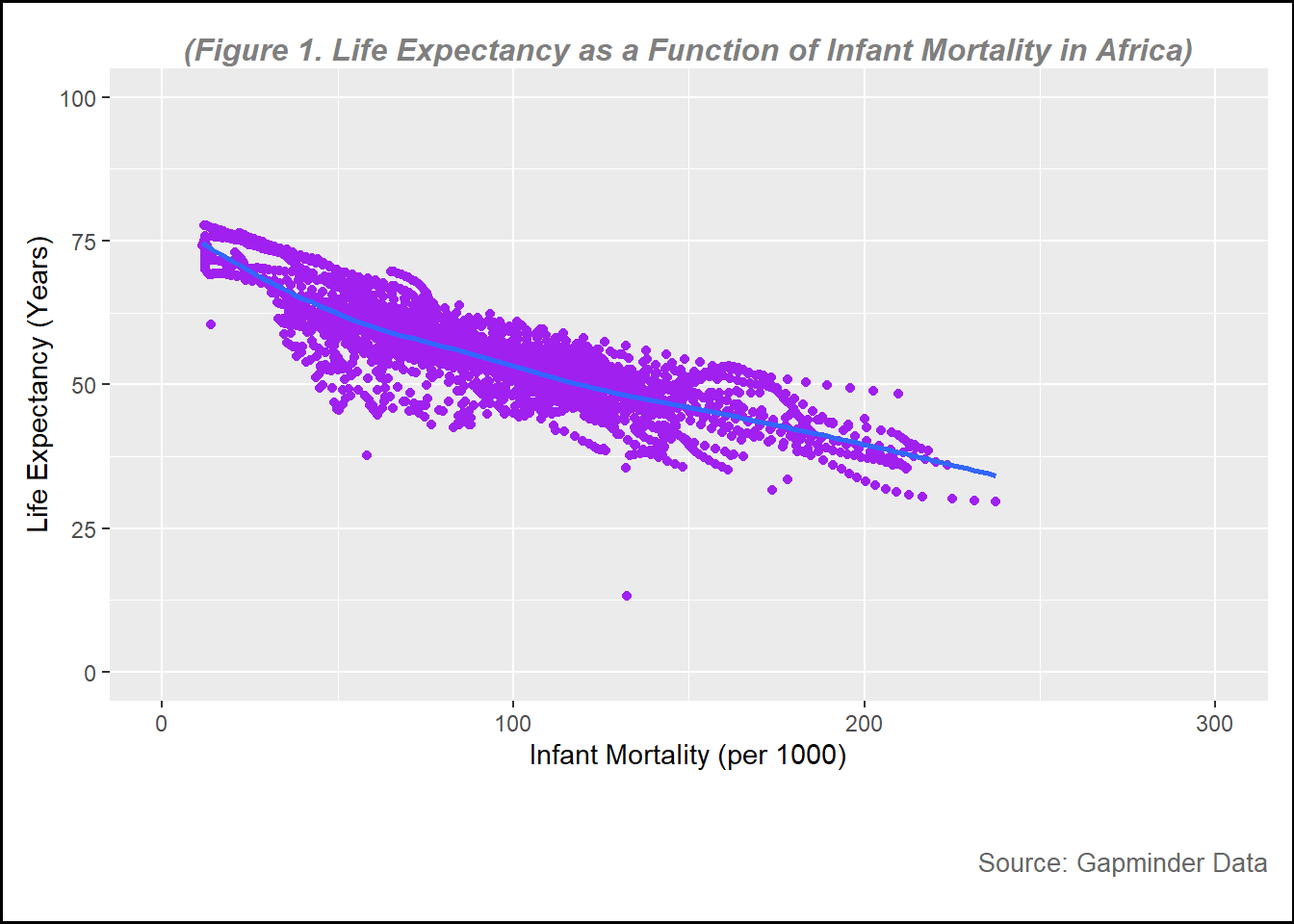
The first plot is a plot of life expectancy as a function of infant mortality in African countries.
plot1 <-ggplot(data = infant, aes(x = infant_mortality, y = life_expectancy)) +geom_point(col ="purple") +# to create plot points and set color to purple geom_smooth(method ="loess", se =FALSE) +# to create line without confidence intervalxlim(c(0, 300)) +# to set x-axis rangeylim(c(0, 100)) +# to set y-axis rangelabs(subtitle ="(Figure 1. Life Expectancy as a Function of Infant Mortality in Africa)", y ="Life Expectancy (Years)",x ="Infant Mortality (per 1000)",caption ="Source: Gapminder Data" ) +# to create the name of each axistheme(plot.background =element_rect(color ="black", size =1), # Border around the entire plot (including title)plot.subtitle =element_text(hjust =0.5, vjust =-1, size =12, color ="gray50", face ="bold.italic"), # to adjust the subtitle position, color and size (note, set vjust=185 for printed pictures, for website, set at 100 )plot.caption =element_text(hjust =1, vjust =-13, size =10, color ="gray40"), # to adjust the subtitle position, color and size, hjust=horizontal and vjust= vertical plot.margin =margin(10, 10, 45, 10) # (top, right, bottom, left) Increase the bottom margin to create space for the subtitle below the x-axis )
Warning: The `size` argument of `element_rect()` is deprecated as of ggplot2 3.4.0.
ℹ Please use the `linewidth` argument instead.
# Print the plotprint(plot1)
`geom_smooth()` using formula = 'y ~ x'
Warning: Removed 226 rows containing non-finite outside the scale range
(`stat_smooth()`).
Warning: Removed 226 rows containing missing values or values outside the scale range
(`geom_point()`).
figure_file =here("images","infant mortality vs life expectancy.png") # to set up location for the pictures created ggsave(filename = figure_file, plot=plot1) # save the pictures created
Saving 7 x 5 in image
`geom_smooth()` using formula = 'y ~ x'
Warning: Removed 226 rows containing non-finite outside the scale range
(`stat_smooth()`).
Removed 226 rows containing missing values or values outside the scale range
(`geom_point()`).
From figure 1, it can be seen that there is a negative relationship between infant mortality rate and life expectancy, the higher the infant mortality the lower life expectancy of a country.
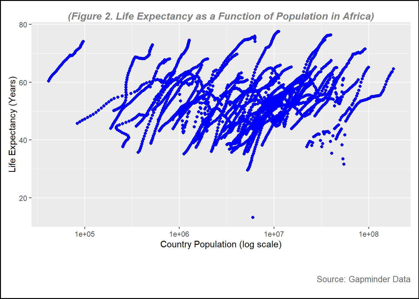
Now, I want to see the relationship between population and life expectancy. In this plot, we will set population on log scale.
plot2 <-ggplot(data = pop, aes(x= population, y= life_expectancy))+geom_point(color="blue")+scale_x_log10() +# this is to set the x-axis in log scale labs(subtitle ="(Figure 2. Life Expectancy as a Function of Population in Africa)", y ="Life Expectancy (Years)",x ="Country Population (log scale)",caption ="Source: Gapminder Data" ) +# to create the name of each axistheme(plot.background =element_rect(color ="black", size =1), # Border around the entire plot (including title)plot.subtitle =element_text(hjust =0.5, vjust =-1, size =12, color ="gray50", face ="bold.italic"), # to adjust the subtitle position, color and size (note, set vjust=185 for printed pictures, for website, set at 100 )plot.caption =element_text(hjust =1, vjust =-13, size =10, color ="gray40"), # to adjust the subtitle position, color and size, hjust=horizontal and vjust= vertical plot.margin =margin(10, 10, 45, 10) # (top, right, bottom, left) Increase the bottom margin to create space for the subtitle below the x-axis )print(plot2)
Warning: Removed 51 rows containing missing values or values outside the scale range
(`geom_point()`).
figure_file =here("images","log_population vs life expectancy.png") # to set up location for the pictures created ggsave(filename = figure_file, plot=plot2) # save the pictures created
Saving 7 x 5 in image
Warning: Removed 51 rows containing missing values or values outside the scale range
(`geom_point()`).
From figure 2, overall there is a positive relationship between country population and life expectanc. However, the data look steak.
There are several factors that might affect this trend. First, the data is over 56 year period (1960 to 2016), where the number of population in most of the country increasing and health condition improving. To get better understanding about this figure, we need to include other variables such as GDP, fertility and other variables.
More data processing
In this step, I am going to find out which year
missing_years <- africadata %>%filter(is.na(infant_mortality)) %>%# Filter rows where infant_mortality is NAselect(year) %>%# Select the 'year' columndistinct() # Get unique years# Display missing yearsprint(missing_years)
There are 23 years with missing data in infant mortality
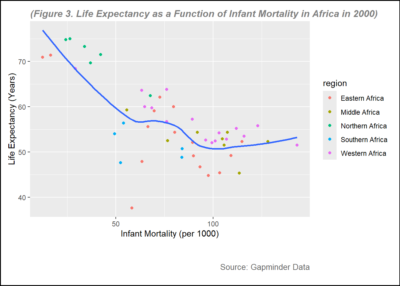
Now, I want to create a new object containing data of the year 2000 only.
data_2000 <- africadata %>%filter(year==2000)
str(data_2000)
'data.frame':   51 obs. of  9 variables:
 $ country         : Factor w/ 185 levels "Albania","Algeria",..: 2 3 18 22 26 27 29 31 32 33 ...
 $ year            : int  2000 2000 2000 2000 2000 2000 2000 2000 2000 2000 ...
 $ infant_mortality: num  33.9 128.3 89.3 52.4 96.2 ...
 $ life_expectancy : num  73.3 52.3 57.2 47.6 52.6 46.7 54.3 68.4 45.3 51.5 ...
 $ fertility       : num  2.51 6.84 5.98 3.41 6.59 7.06 5.62 3.7 5.45 7.35 ...
 $ population      : num  31183658 15058638 6949366 1736579 11607944 ...
 $ gdp             : num  5.48e+10 9.13e+09 2.25e+09 5.63e+09 2.61e+09 ...
 $ continent       : Factor w/ 5 levels "Africa","Americas",..: 1 1 1 1 1 1 1 1 1 1 ...
 $ region          : Factor w/ 22 levels "Australia and New Zealand",..: 11 10 20 17 20 5 10 20 10 10 ...
summary(data_2000)
         country        year      infant_mortality life_expectancy
 Algeria     : 1   Min.   :2000   Min.   : 12.30   Min.   :37.60
 Angola      : 1   1st Qu.:2000   1st Qu.: 60.80   1st Qu.:51.75
 Benin       : 1   Median :2000   Median : 80.30   Median :54.30
 Botswana    : 1   Mean   :2000   Mean   : 78.93   Mean   :56.36
 Burkina Faso: 1   3rd Qu.:2000   3rd Qu.:103.30   3rd Qu.:60.00
 Burundi     : 1   Max.   :2000   Max.   :143.30   Max.   :75.00
 (Other)     :45
   fertility       population             gdp               continent
 Min.   :1.990   Min.   :    81154   Min.   :2.019e+08   Africa  :51
 1st Qu.:4.150   1st Qu.:  2304687   1st Qu.:1.274e+09   Americas: 0
 Median :5.550   Median :  8799165   Median :3.238e+09   Asia    : 0
 Mean   :5.156   Mean   : 15659800   Mean   :1.155e+10   Europe  : 0
 3rd Qu.:5.960   3rd Qu.: 17391242   3rd Qu.:8.654e+09   Oceania : 0
 Max.   :7.730   Max.   :122876723   Max.   :1.329e+11

                       region
 Eastern Africa           :16
 Western Africa           :16
 Middle Africa            : 8
 Northern Africa          : 6
 Southern Africa          : 5
 Australia and New Zealand: 0
 (Other)                  : 0
there are 51 country selected in 2000 without missing data for child mortatlity
plot3 <-ggplot(data = data_2000, aes(x = infant_mortality, y = life_expectancy)) +geom_point(aes(color = region)) +# Map 'region' to the color aestheticgeom_smooth(method ="loess", se =FALSE) +# Add a smoothing linelabs(subtitle ="(Figure 3. Life Expectancy as a Function of Infant Mortality in Africa in 2000)", y ="Life Expectancy (Years)",x ="Infant Mortality (per 1000)",caption ="Source: Gapminder Data" ) +theme(plot.background =element_rect(color ="black", size =1), # Border around the entire plotplot.subtitle =element_text(hjust =0, vjust=0, size =12, color ="gray50", face ="bold.italic"), # Adjust subtitle positionplot.caption =element_text(hjust =1, vjust=-13, size =10, color ="gray40"), # Adjust caption positionplot.margin =margin(10, 10, 45, 10) # Adjust margins (top, right, bottom, left) )print(plot3)
`geom_smooth()` using formula = 'y ~ x'
figure_file =here("images","infant mortality vs life expectancy in 2000.png") # to set up location for the pictures created ggsave(filename = figure_file, plot=plot3) # save the pictures created
Saving 7 x 5 in image
`geom_smooth()` using formula = 'y ~ x'
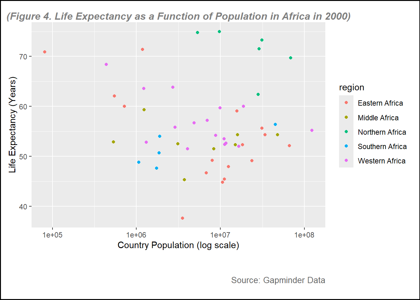
Let see the plot for life expectancy vs country population
plot4 <-ggplot(data = data_2000, aes(x= population, y= life_expectancy))+geom_point(aes(color = region)) +scale_x_log10() +# this is to set the x-axis in log scale labs(subtitle ="(Figure 4. Life Expectancy as a Function of Population in Africa in 2000)", y ="Life Expectancy (Years)",x ="Country Population (log scale)",caption ="Source: Gapminder Data" ) +# to create the name of each axistheme(plot.background =element_rect(color ="black", size =1), # Border around the entire plot (including title)plot.subtitle =element_text(hjust =0.5, vjust =-1, size =12, color ="gray50", face ="bold.italic"), # to adjust the subtitle position, color and size (note, set vjust=185 for printed pictures, for website, set at 100 )plot.caption =element_text(hjust =1, vjust =-13, size =10, color ="gray40"), # to adjust the subtitle position, color and size, hjust=horizontal and vjust= vertical plot.margin =margin(10, 10, 45, 10) # (top, right, bottom, left) Increase the bottom margin to create space for the subtitle below the x-axis )print(plot4)
figure_file =here("images","log_population vs life expectancy in 2000.png") # to set up location for the pictures created ggsave(filename = figure_file, plot=plot4) # save the pictures created
Saving 7 x 5 in image
From figure 3 and figure 4, the points of the plots are more clear because the data is only for the year 2000. In these figures, I use different color based on the region, it can help visualize some figures. For example, we can see that overall, Northern Africa region generally had higher life expectancy compared to other regions, while eastern region had lower life expectancy.
Fitting simple models
In this part, I want to perform simple linear model to look at the relationship between infant mortality and life expectancy, and country population on life expectancy.
fit1 <-lm(life_expectancy ~ infant_mortality, data = data_2000)summary(fit1)
Call:
lm(formula = life_expectancy ~ infant_mortality, data = data_2000)

Residuals:
     Min       1Q   Median       3Q      Max
-22.6651  -3.7087   0.9914   4.0408   8.6817

Coefficients:
                 Estimate Std. Error t value Pr(>|t|)
(Intercept)      71.29331    2.42611  29.386  < 2e-16 ***
infant_mortality -0.18916    0.02869  -6.594 2.83e-08 ***
---
Signif. codes:  0 '***' 0.001 '**' 0.01 '*' 0.05 '.' 0.1 ' ' 1

Residual standard error: 6.221 on 49 degrees of freedom
Multiple R-squared:  0.4701,    Adjusted R-squared:  0.4593
F-statistic: 43.48 on 1 and 49 DF,  p-value: 2.826e-08
Based on the simple linear model, the intercept is 71.4, meaning that the average life expectancy is 71.4 years when the infant mortality is 0. It is estimated that every 1000 increase child mortality results in decrease life expectancy by 0.2 year Based on the alpha=0.05, it can be concluded that there is a statistically significant relationship between infant mortality rate and life expectancy with p<.0001.
fit2 <-lm(life_expectancy ~ population, data = data_2000)summary(fit2)
Call:
lm(formula = life_expectancy ~ population, data = data_2000)

Residuals:
    Min      1Q  Median      3Q     Max
-18.429  -4.602  -2.568   3.800  18.802

Coefficients:
             Estimate Std. Error t value Pr(>|t|)
(Intercept) 5.593e+01  1.468e+00  38.097   <2e-16 ***
population  2.756e-08  5.459e-08   0.505    0.616
---
Signif. codes:  0 '***' 0.001 '**' 0.01 '*' 0.05 '.' 0.1 ' ' 1

Residual standard error: 8.524 on 49 degrees of freedom
Multiple R-squared:  0.005176,  Adjusted R-squared:  -0.01513
F-statistic: 0.2549 on 1 and 49 DF,  p-value: 0.6159
The second model explain the relationship between life expectancy and country population. Based on the intercept, it is estimated that when country population is zero, the average life expectancy is 5.6 years, but in the reality, it does not make sense since none of country has 0 population. Based on the alpha= 5% there is no significant relationship between country population and life expectancy with p=0.616.
Natalie’s Addition to Muhammad’s Exercise 3
This section is contributed to by Natalie Cann.
I will first load packages needed for this exercise.
I will use the “help()” function on the “us_contagious_diseases” data from dslabs.
help(us_contagious_diseases)
The help file told me that this data frame contains yearly counts for Hepatitis A, Measles, Mumps, Pertussis, Polio, Rubella, and Smallpox in the United States.
Now, I will use str() on the “us_contagious_diseases” data frame.
This informs me that the data set contains 6 variables (disease, state, year, weeks_reporting, count, and population) and 16,065 observations. Disease and state are factors, while the other four variables are numeric.
Next, I will use the summary() on the “us_contagious_diseases” data frame.
summary(us_contagious_diseases)
        disease            state            year      weeks_reporting
 Hepatitis A:2346   Alabama   :  315   Min.   :1928   Min.   : 0.00
 Measles    :3825   Alaska    :  315   1st Qu.:1950   1st Qu.:31.00
 Mumps      :1785   Arizona   :  315   Median :1975   Median :46.00
 Pertussis  :2856   Arkansas  :  315   Mean   :1971   Mean   :37.38
 Polio      :2091   California:  315   3rd Qu.:1990   3rd Qu.:50.00
 Rubella    :1887   Colorado  :  315   Max.   :2011   Max.   :52.00
 Smallpox   :1275   (Other)   :14175
     count          population
 Min.   :     0   Min.   :   86853
 1st Qu.:     7   1st Qu.: 1018755
 Median :    69   Median : 2749249
 Mean   :  1492   Mean   : 4107584
 3rd Qu.:   525   3rd Qu.: 4996229
 Max.   :132342   Max.   :37607525
                  NA's   :214
The summary above shows the diseases and states. It also shows the minimum, 1st quartile, median, mean, 3rd quartile and maximum values for the numeric variables (year, weeks_reporting, count, and population).
First, I will create a data frame containing only data for the state of Georgia.
GA_contagious_diseases <-filter(us_contagious_diseases, state =="Georgia") # I am using filter to obtain only data from GAView(GA_contagious_diseases) # I am viewing the data frame to ensure it only contains data from GA
This worked, as only GA data is shown in the new data frame.
Now, I will run str() and summary() on the GA_contagious_diseases data frame.
        disease          state          year      weeks_reporting
 Hepatitis A:46   Georgia   :315   Min.   :1928   Min.   : 0.00
 Measles    :75   Alabama   :  0   1st Qu.:1950   1st Qu.:33.00
 Mumps      :35   Alaska    :  0   Median :1975   Median :45.00
 Pertussis  :56   Arizona   :  0   Mean   :1971   Mean   :37.66
 Polio      :41   Arkansas  :  0   3rd Qu.:1990   3rd Qu.:49.00
 Rubella    :37   California:  0   Max.   :2011   Max.   :52.00
 Smallpox   :25   (Other)   :  0
     count           population
 Min.   :    0.0   Min.   :2901933
 1st Qu.:    8.5   1st Qu.:3444578
 Median :   42.0   Median :5009127
 Mean   :  643.0   Mean   :5235135
 3rd Qu.:  352.0   3rd Qu.:6478216
 Max.   :22965.0   Max.   :9830160
This shows me that all the variables are the same as before, but they only contain data from GA.
Now, I will create a data frame that contains only data from GA in 1950. I will use this data frame to create a plot of the number of cases of each disease in GA in 1950.
GA_contagious_diseases_1950 <-filter(GA_contagious_diseases, year ==1950) # I am using filter to obtain only data from GA in 1950# I will run str() and summar() on the GA_contagious_diseases_1950 data frame to get a better look at the datastr(GA_contagious_diseases_1950)
'data.frame':   4 obs. of  6 variables:
 $ disease        : Factor w/ 7 levels "Hepatitis A",..: 2 4 5 7
 $ state          : Factor w/ 51 levels "Alabama","Alaska",..: 11 11 11 11
 $ year           : num  1950 1950 1950 1950
 $ weeks_reporting: num  48 50 38 0
 $ count          : num  2159 1041 492 0
 $ population     : num  3444578 3444578 3444578 3444578
summary(GA_contagious_diseases_1950)
        disease         state        year      weeks_reporting     count
 Hepatitis A:0   Georgia   :4   Min.   :1950   Min.   : 0.0    Min.   :   0.0
 Measles    :1   Alabama   :0   1st Qu.:1950   1st Qu.:28.5    1st Qu.: 369.0
 Mumps      :0   Alaska    :0   Median :1950   Median :43.0    Median : 766.5
 Pertussis  :1   Arizona   :0   Mean   :1950   Mean   :34.0    Mean   : 923.0
 Polio      :1   Arkansas  :0   3rd Qu.:1950   3rd Qu.:48.5    3rd Qu.:1320.5
 Rubella    :0   California:0   Max.   :1950   Max.   :50.0    Max.   :2159.0
 Smallpox   :1   (Other)   :0
   population
 Min.   :3444578
 1st Qu.:3444578
 Median :3444578
 Mean   :3444578
 3rd Qu.:3444578
 Max.   :3444578
You can see that now, the only year appearing in the data set is 1950. Therefore, all the variables now reflect only data from 1950 in GA.
Next, I will rename the “count” variable to “number_of_cases”.
GA_contagious_diseases_1950 <-rename(GA_contagious_diseases_1950, number_of_cases = count) # I am renaming the "count" variable to "number_of_cases" via the rename() function (and then assigning it back to GA_contagious_diseases_1950)colnames(GA_contagious_diseases_1950) # I am checking to see if the previous step was done properly
I see this was done correctly, as the variable that used to be called “count” is now called “number_of_cases”.
Now, I will create a bar graph to display the number of cases of each contagious disease reported in GA in 1950.
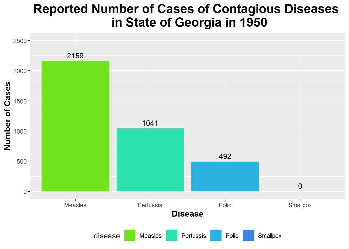
custom_colors_1950 <-c("Measles"="#6fe51e", "Pertussis"="#2ce1b0", "Polio"="#2cb2e1", "Smallpox"="#3a83e6") # I am creating a vector of colors that I will use to fill each disease's bar on the graph belowggplot(GA_contagious_diseases_1950, aes (x = disease, y = number_of_cases, fill = disease)) +# Using ggplot on the GA_contagious_diseases_1950 data frame and setting x and y equal to diseases and number of cases (respectively) and setting fill equal to diseasegeom_bar(stat ="identity") +# Specifying the geom as geom_bar() to create a bar graph labs(title ="Reported Number of Cases of Contagious Diseases \n in State of Georgia in 1950", x ="Disease", y ="Number of Cases") +# Renaming title and axesscale_fill_manual(values = custom_colors_1950) +# Setting the fill colors of the bars to the custom colors I created above geom_text(aes(label = number_of_cases), vjust =-0.5) +# Adding text labels to the top of each bar to show the number of casestheme(legend.position ="bottom", plot.title =element_text(size =18, face ="bold", hjust =0.5), axis.title.x =element_text(size =12, face ="bold"), axis.title.y =element_text(size =12, face ="bold")) +# Putting legend at the bottom; increasing size, boldness, and center of title/axesscale_y_continuous(limits =c(0, 2500), breaks =seq(0, 2500, by =500)) # Setting the y-axis limits and breaks to better see the text of number of cases at the top
You can see from the bar graph above that the number of Measles cases in GA in 1950 was the highest out of all the diseases shown here (with the number of cases being 2159).
Now, I will create a data frame that contains Measles data from all states in 1950.
Measles_1950 <-filter(us_contagious_diseases, disease =="Measles", year ==1950) # I am using filter to obtain only Measles data from all states in 1950# I will run str() and summary() on the Measles_1950 data frame to get a better look at the datastr(Measles_1950)
        disease          state         year      weeks_reporting
 Hepatitis A: 0   Alabama   : 1   Min.   :1950   Min.   : 0.0
 Measles    :51   Alaska    : 1   1st Qu.:1950   1st Qu.:46.0
 Mumps      : 0   Arizona   : 1   Median :1950   Median :49.0
 Pertussis  : 0   Arkansas  : 1   Mean   :1950   Mean   :45.9
 Polio      : 0   California: 1   3rd Qu.:1950   3rd Qu.:50.0
 Rubella    : 0   Colorado  : 1   Max.   :1950   Max.   :51.0
 Smallpox   : 0   (Other)   :45
     count           population
 Min.   :    0.0   Min.   :  160083
 1st Qu.:  853.5   1st Qu.:  791896
 Median : 2301.0   Median : 2233351
 Mean   : 5909.4   Mean   : 3075456
 3rd Qu.: 6000.0   3rd Qu.: 3444578
 Max.   :36859.0   Max.   :14830192
                   NA's   :2
This shows data only from the Measles disease; it includes data from every state that reported measles data in 1950.
Once again, I will rename the “count” variable to “number_of_cases”.
Measles_1950 <-rename(Measles_1950, number_of_cases = count) # I am renaming the "count" variable to "number_of_cases" via the rename() function colnames(Measles_1950) # Making sure this was done correctly
As seen by the output, I can see that this variable is now called “number_of_cases”.
Now, I will create a bar graph to display the number of Measles cases reported in each state in 1950.
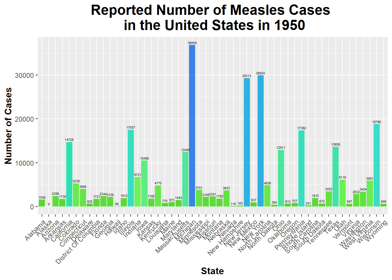
custom_colors_Measles_1950 <-c("#53d127", "#71f45d", "#2ce1b0", "#40dcd9", "#2cb2e1", "#3a83e6")ggplot(Measles_1950, aes(x = state, y = number_of_cases, fill = number_of_cases)) +geom_bar(stat ="identity") +# Correct stat for using y data directlylabs(title ="Reported Number of Measles Cases \n in the United States in 1950", x ="State", y ="Number of Cases") +# Rename title and axesgeom_text(aes(label = number_of_cases), vjust =-0.5, size =1.5) +# Display labels above barstheme(legend.position ="none", # Remove legend plot.title =element_text(size =18, face ="bold", hjust =0.5), axis.title.x =element_text(size =12, face ="bold"), axis.title.y =element_text(size =12, face ="bold"), # Increase size and boldness of title and axesaxis.text.x =element_text(angle =45, hjust =1)) +# Rotate state namesscale_fill_gradientn(colors = custom_colors_Measles_1950) # Set custom color scheme made
This bar graph shows the number of Measles cases reported in each state in 1950. As you can see, Michigan had the highest number of reported cases of Measles; on the other hand, Alaska had the lowest number of reported cases of Measles.
Now, I will create a new variable within the Measles_1950 data frame that assess number of cases in each region of the country.
Measles_1950$region <-ifelse(Measles_1950$state %in%c("Maine", "New Hampshire", "Vermont", "Massachusetts", "Rhode Island", "Connecticut", "New York", "New Jersey", "Pennsylvania", "Delaware", "Maryland", "District Of Columbia"), "Northeast", # contains states from the Northeastifelse(Measles_1950$state %in%c("Ohio", "Michigan", "Indiana", "Illinois", "Wisconsin", "Minnesota", "Iowa", "Missouri", "North Dakota", "South Dakota", "Nebraska", "Kansas"), "Midwest", # contains states from the Midwestifelse(Measles_1950$state %in%c("Virginia", "West Virginia", "North Carolina", "South Carolina", "Georgia", "Florida", "Kentucky", "Tennessee", "Alabama", "Mississippi", "Arkansas", "Louisiana"), "South", # contains states from the Southifelse(Measles_1950$state %in%c("Texas", "Oklahoma", "New Mexico", "Arizona"), "Southwest", # contains states from the Southwestifelse(Measles_1950$state %in%c("Alaska", "Hawaii"), "Non-Contiguous", # contains states not connected to the main US"West"))))) # any other state will be categorized as the Westhead(Measles_1950) # I am checking to ensure this was done properly
  disease      state year weeks_reporting number_of_cases population
1 Measles    Alabama 1950              47            1556    3061743
2 Measles     Alaska 1950               0               0         NA
3 Measles    Arizona 1950              49            2389     749587
4 Measles   Arkansas 1950              50            1739    1909511
5 Measles California 1950              50           14728   10586224
6 Measles   Colorado 1950              50            5239    1325089
          region
1          South
2 Non-Contiguous
3      Southwest
4          South
5           West
6           West
I will create a version of this data frame that contains the number of cases of Measles in each region of the US.
region_Measles_cases_1950 <- Measles_1950 %>%# Creating new data frame that groups data by region and then includes the total number of cases in each regiongroup_by(region) %>%summarize(total_cases =sum(number_of_cases))
Now, we can create a bar graph to display the number of Measles cases reported in each region in 1950.
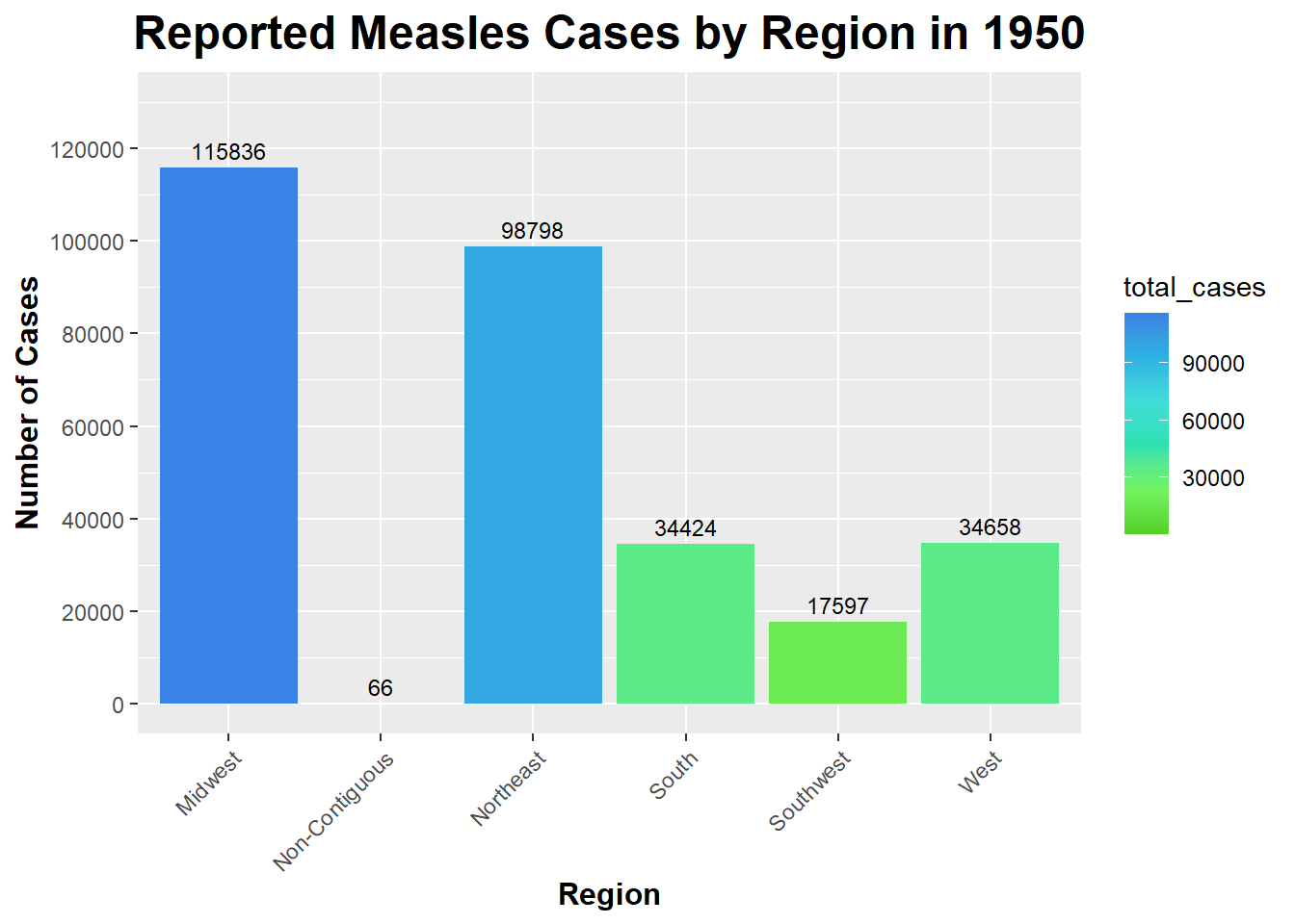
ggplot(region_Measles_cases_1950, aes(x = region, y = total_cases, fill = total_cases)) +# Using ggplot on the region_Measles_cases_1950 data frame and setting x and y equal to region and total_cases (respectively) and setting fill equal to regiongeom_bar(stat ="identity") +# Use 'identity' since we are providing y values directlylabs(title ="Reported Measles Cases by Region in 1950", x ="Region", y ="Number of Cases") +# Rename title and axesgeom_text(aes(label = total_cases), vjust =-0.5, size =3) +# Add labels above barstheme(legend.position ="right", plot.title =element_text(size =18, face ="bold", hjust =0.5),axis.title.x =element_text(size =12, face ="bold"), axis.title.y =element_text(size =12, face ="bold"), # Increase size and boldness of title and axesaxis.text.x =element_text(angle =45, hjust =1)) +# Rotate state namesscale_y_continuous(limits =c(0, 130000), breaks =seq(0, 130000, by =20000)) +# Setting the y-axis limits and breaks to better see the text of number of cases at the topscale_fill_gradientn(colors = custom_colors_Measles_1950) # Set custom color scheme made
As you can see, the Midwest had the highest number of reported Measles cases in 1950 (115836). The Non-Contiguous region had the lowest number of reported Measles cases in 1950 (0) - it is important to note that Alaska and Hawaii are the only states in this region and that Alaska did not report any cases.
I will create a Scatterplot of the number of cases of Measles in each state in 1950.
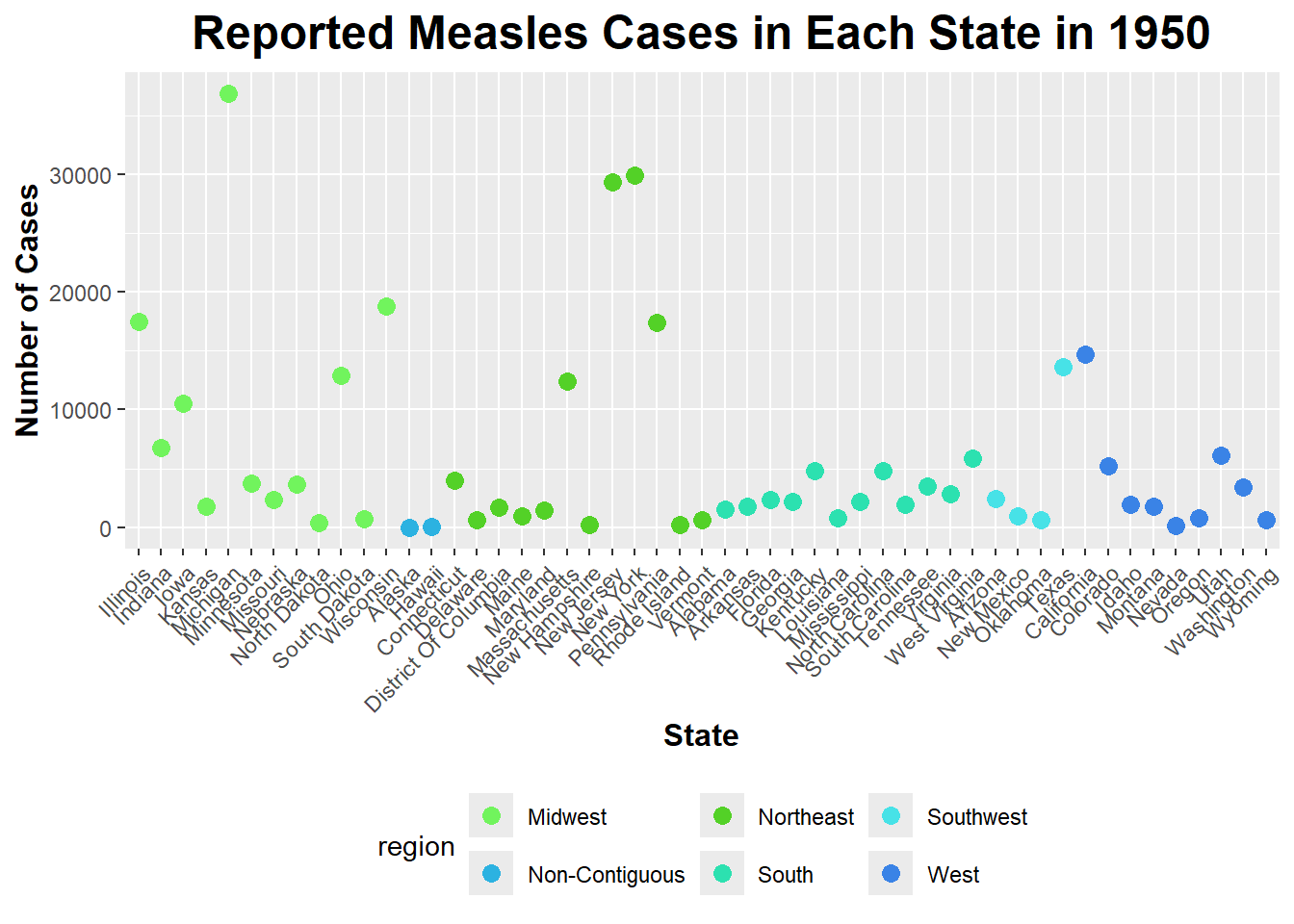
Measles_1950$state <-factor(Measles_1950$state, levels =unique(Measles_1950$state[order(Measles_1950$region)]))# I am reordering the states based on the region they are in (instead of alphabetical order) via levels(), unique(), and order()ggplot(Measles_1950, aes(x = state, y = number_of_cases, color = region)) +geom_point(size =3) +# Specify geom as geom_point to make a scatterplotlabs(title ="Reported Measles Cases in Each State in 1950", x ="State", y ="Number of Cases") +# Rename title and axestheme(axis.text.x =element_text(angle =45, hjust =1), # Rotate state names legend.position ="bottom", # Position legend at the bottomplot.title =element_text(size =18, face ="bold", hjust =0.5), axis.title.x =element_text(size =12, face ="bold"), axis.title.y =element_text(size =12, face ="bold")) +# Increase size and boldness of title and axesscale_color_manual(values =c("Northeast"="#53d127", "Midwest"="#71f45d", "South"="#2ce1b0", "Southwest"="#47e2e7", "Non-Contiguous"="#2cb2e1", "West"="#3a83e6")) # Assign specific colors to each region
As you can see from the scatterplot above, the Midwest and the Northeast have the greatest amount of variation in the number of reported Measles cases in 1950.
I will now use the lm() function to fit a linear model with number_of_cases as the outcome and region of the United States as the predictor. Then, I will apply the summary() function to view the results.
fit_1950 <-lm(number_of_cases ~ region, data = Measles_1950) # Running a linear fit via lm()summary(fit_1950) # Viewing results of linear model via summary()
Call:
lm(formula = number_of_cases ~ region, data = Measles_1950)

Residuals:
   Min     1Q Median     3Q    Max
 -9259  -5078  -1130   1937  27206

Coefficients:
                     Estimate Std. Error t value Pr(>|t|)
(Intercept)              9653       2353   4.103 0.000169 ***
regionNon-Contiguous    -9620       6224  -1.546 0.129227
regionNortheast         -1420       3327  -0.427 0.671600
regionSouth             -6784       3327  -2.039 0.047339 *
regionSouthwest         -5254       4705  -1.117 0.270105
regionWest              -5802       3594  -1.615 0.113405
---
Signif. codes:  0 '***' 0.001 '**' 0.01 '*' 0.05 '.' 0.1 ' ' 1

Residual standard error: 8150 on 45 degrees of freedom
Multiple R-squared:  0.1334,    Adjusted R-squared:  0.03716
F-statistic: 1.386 on 5 and 45 DF,  p-value: 0.2476
The P-value of this model is greater than 0.05, which means we must fail to reject the null hypothesis (that there is no relationship between the number of Measles cases and the region of the US). This means that the region of the US does not have a significant impact on the number of Measles cases reported in 1950.
I will run an ANOVA (Analysis of Variance) test to asses if there are significant differences in the means of the number of Measles cases reported in each region in the US in 1950.
anova_result <-aov(number_of_cases ~ region, data = Measles_1950) # Running ANOVA test with aov() functionsummary(anova_result) # Viewing a summary of results
            Df    Sum Sq  Mean Sq F value Pr(>F)
region       5 4.602e+08 92049896   1.386  0.248
Residuals   45 2.989e+09 66418472
The F-value of the ANOVA table is 1.386, and the P-value is 0.248. Since 0.248 > 0.05, we must fail to reject the null hypothesis, which is stated previously. Therefore, this result is consistent with the linear fit model results above; region of the US does not appear to have a significant impact on the number of Measles cases in 1950.
I will now put the summary into a table.
anova_df <-as.data.frame(summary(anova_result)[[1]]) # Putting the summary of the ANOVA test into a data frame print(anova_df) # To Printing the data frame
            Df     Sum Sq  Mean Sq  F value    Pr(>F)
region       5  460249478 92049896 1.385908 0.2476114
Residuals   45 2988831236 66418472       NA        NA